Quick start: Create an Amazon QuickSight analysis with a single visual using sample data
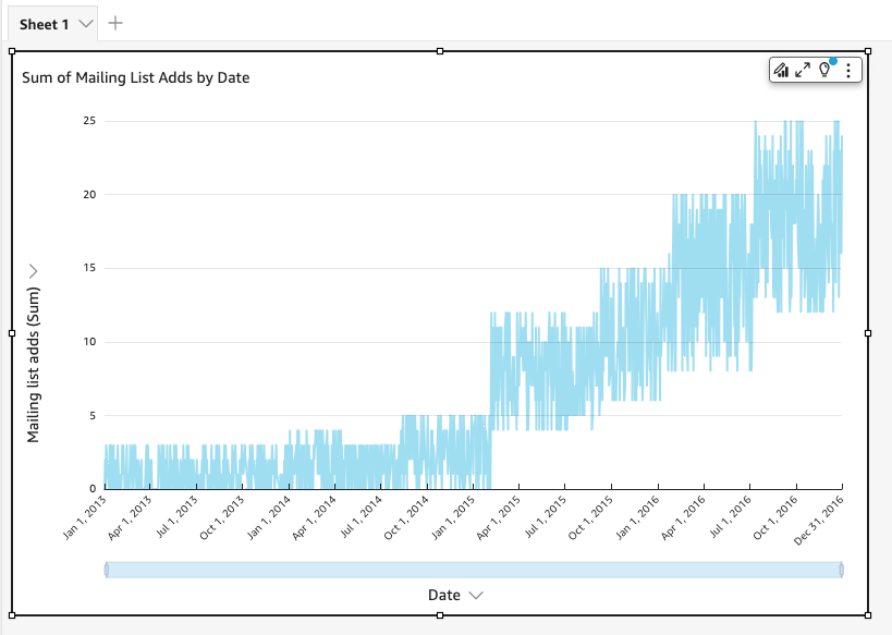
With the following procedure, you use the Web and Social Media Analytics sample dataset to create an analysis containing a line chart visual. This visual shows the count by month of people that have added themselves to the mailing list.
To create an analysis containing a line chart visual using a sample dataset
-
On the Amazon QuickSight start page, choose New analysis. If you don't have the sample data, you can download it from web-and-social-analytics.csv.zip. Unzip the file so you can use the .csv file.
To upload the sample data, do the following:
-
Choose New dataset. You can also add a new dataset from the Datasets page. To do this, choose Datasets, and then choose New dataset.
-
Choose Upload a file.
-
Choose the sample file,
web-and-social-analytics.csv, from your drive. If you don't see it, check that you unzipped theweb-and-social-analytics.csv.zipfile. -
Confirm file upload settings by choosing Next on the Confirm file upload settings screen.
-
Choose Visualize on the Data source details screen.
-
Skip the next step. Choosing Visualize brings you to the same screen as the process in Step 2.
-
-
On the Datasets page, choose the Web and Social Media Analytics dataset, and then choose Use in Analysis at upper right.
-
In the Data pane, choose Date, and then choose Mailing list adds.

Amazon QuickSight uses AutoGraph to create the visual, selecting the visual type that it determines is most compatible with those fields. In this case, it selects a line chart that shows mailing list adds by day, which is the date granularity default.

-
Navigate to the Field wells at the bottom of the Visuals pane.

-
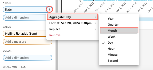
Choose the X axis field well, choose Aggregate, and then choose Month.

The line chart updates to show mailing list adds by month, rather than by the default of by year.
