Explore the profile output data visualized in the SageMaker Profiler UI
Note
On 6/30/27, AWS will discontinue support for Amazon SageMaker Profiler. After 6/30/27, you will no longer be able to access the Profiler console or Profiler resources. For more information, see Profiler availability change.
This section walks through the SageMaker Profiler UI and provides tips for how to use and gain insights from it.
Load profile
When you open the SageMaker Profiler UI, the Load profile page opens up. To load and generate the Dashboard and Timeline, go through the following procedure.
To load the profile of a training job
-
From the List of training jobs section, use the check box to choose the training job for which you want to load the profile.
-
Choose Load. The job name should appear in the Loaded profile section at the top.
-
Choose the radio button on the left of the Job name to generate the Dashboard and Timeline. Note that when you choose the radio button, the UI automatically opens the Dashboard. Note also that if you generate the visualizations while the job status and loading status still appear to be in progress, the SageMaker Profiler UI generates Dashboard plots and a Timeline up to the most recent profile data collected from the ongoing training job or the partially loaded profile data.
Tip
You can load and visualize one profile at a time. To load another profile, you must first unload the previously loaded profile. To unload a profile, use the trash bin icon on the right end of the profile in the Loaded profile section.

Dashboard
After you finish loading and selecting the training job, the UI opens the Dashboard page furnished with the following panels by default.
-
GPU active time – This pie chart shows the percentage of GPU active time versus GPU idle time. You can check if your GPUs are more active than idle throughout the entire training job. GPU active time is based on the profile data points with a utilization rate greater than 0%, whereas GPU idle time is the profiled data points with 0% utilization.
-
GPU utilization over time – This timeline graph shows the average GPU utilization rate over time per node, aggregating all of the nodes in a single chart. You can check if the GPUs have an unbalanced workload, under-utilization issues, bottlenecks, or idle issues during certain time intervals. To track the utilization rate at the individual GPU level and related kernel runs, use the Timeline interface. Note that the GPU activity collection starts from where you added the profiler starter function
SMProf.start_profiling()in your training script, and stops atSMProf.stop_profiling(). -
CPU active time – This pie chart shows the percentage of CPU active time versus CPU idle time. You can check if your CPUs are more active than idle throughout the entire training job. CPU active time is based on the profiled data points with a utilization rate greater than 0%, whereas CPU idle time is the profiled data points with 0% utilization.
-
CPU utilization over time – This timeline graph shows the average CPU utilization rate over time per node, aggregating all of the nodes in a single chart. You can check if the CPUs are bottlenecked or underutilized during certain time intervals. To track the utilization rate of the CPUs aligned with the individual GPU utilization and kernel runs, use the Timeline interface. Note that the utilization metrics start from the start from the job initialization.
-
Time spent by all GPU kernels – This pie chart shows all GPU kernels operated throughout the training job. It shows the top 15 GPU kernels by default as individual sectors and all other kernels in one sector. Hover over the sectors to see more detailed information. The value shows the total time of the GPU kernels operated in seconds, and the percentage is based on the entire time of the profile.
-
Time spent by top 15 GPU kernels – This pie chart shows all GPU kernels operated throughout the training job. It shows the top 15 GPU kernels as individual sectors. Hover over the sectors to see more detailed information. The value shows the total time of the GPU kernels operated in seconds, and the percentage is based on the entire time of the profile.
-
Launch counts of all GPU kernels – This pie chart shows the number of counts for every GPU kernel launched throughout the training job. It shows the top 15 GPU kernels as individual sectors and all other kernels in one sector. Hover over the sectors to see more detailed information. The value shows the total count of the launched GPU kernels, and the percentage is based on the entire count of all kernels.
-
Launch counts of top 15 GPU kernels – This pie chart shows the number of counts of every GPU kernel launched throughout the training job. It shows the top 15 GPU kernels. Hover over the sectors to see more detailed information. The value shows the total count of the launched GPU kernels, and the percentage is based on the entire count of all kernels.
-
Step time distribution – This histogram shows the distribution of step durations on GPUs. This plot is generated only after you add the step annotator in your training script.
-
Kernel precision distribution – This pie chart shows the percentage of time spent on running kernels in different data types such as FP32, FP16, INT32, and INT8.
-
GPU activity distribution – This pie chart shows the percentage of time spent on GPU activities, such as running kernels, memory (
memcpyandmemset), and synchronization (sync). -
GPU memory operations distribution – This pie chart shows the percentage of time spent on GPU memory operations. This visualizes the
memcopyactivities and helps identify if your training job is spending excessive time on certain memory operations. -
Create a new histogram – Create a new diagram of a custom metric you annotated manually during Step 1: Adapt your training script using the SageMaker Profiler Python modules. When adding a custom annotation to a new histogram, select or type the name of the annotation you added in the training script. For example, in the demo training script in Step 1,
step,Forward,Backward,Optimize, andLossare the custom annotations. While creating a new histogram, these annotation names should appear in the drop-down menu for metric selection. If you chooseBackward, the UI adds the histogram of the time spent on backward passes throughout the profiled time to the Dashboard. This type of histogram is useful for checking if there are outliers taking abnormally longer time and causing bottleneck problems.
The following screenshots show the GPU and CPU active time ratio and the average GPU and CPU utilization rate with respect to time per compute node.

The following screenshot shows an example of pie charts for comparing how many times the GPU kernels are launched and measuring the time spent on running them. In the Time spent by all GPU kernels and Launch counts of all GPU kernels panels, you can also specify an integer to the input field for k to adjust the number of legend to show in the plots. For example, if you specify 10, the plots show the top 10 most run and launched kernels respectively.

The following screenshot shows an example of step time duration histogram, and pie charts for the kernel precision distribution, GPU activity distribution, and GPU memory operation distribution.

Timeline interface
To gain a detailed view into the compute resources at the level of operations and kernels scheduled on the CPUs and run on the GPUs, use the Timeline interface.
You can zoom in and out and pan left or right in the timeline interface using your
mouse, the [w, a, s, d] keys, or the four arrow keys on the
keyboard.
Tip
For more tips on the keyboard shortcuts to interact with the Timeline interface, choose Keyboard shortcuts in the left pane.
The timeline tracks are organized in a tree structure, giving you information from
the host level to the device level. For example, if you run N instances
with eight GPUs in each, the timeline structure of each instance would be as
follows.
-
algo-inode – This is what SageMaker AI tags to assign jobs to provisioned instances. The digit inode is randomly assigned. For example, if you use 4 instances, this section expands from algo-1 to algo-4.
-
CPU – In this section, you can check the average CPU utilization rate and performance counters.
-
GPUs – In this section, you can check the average GPU utilization rate, individual GPU utilization rate, and kernels.
-
SUM Utilization – The average GPU utilization rates per instance.
-
HOST-0 PID-123 – A unique name assigned to each process track. The acronym PID is the process ID, and the number appended to it is the process ID number that's recorded during data capture from the process. This section shows the following information from the process.
-
GPU-inum_gpu utilization – The utilization rate of the inum_gpu-th GPU over time.
-
GPU-inum_gpu device – The kernel runs on the inum_gpu-th GPU device.
-
stream icuda_stream – CUDA streams showing kernel runs on the GPU device. To learn more about CUDA streams, see the slides in PDF at CUDA C/C++ Streams and Concurrency
provided by NVIDIA.
-
-
GPU-inum_gpu host – The kernel launches on the inum_gpu-th GPU host.
-
-
-
The following several screenshots show the Timeline of the
profile of a training job run on ml.p4d.24xlarge instances, which are
equipped with 8 NVIDIA A100 Tensor Core GPUs in each.
The following is a zoomed-out view of the profile, printing a dozen of steps
including an intermittent data loader between step_232 and
step_233 for fetching the next data batch.
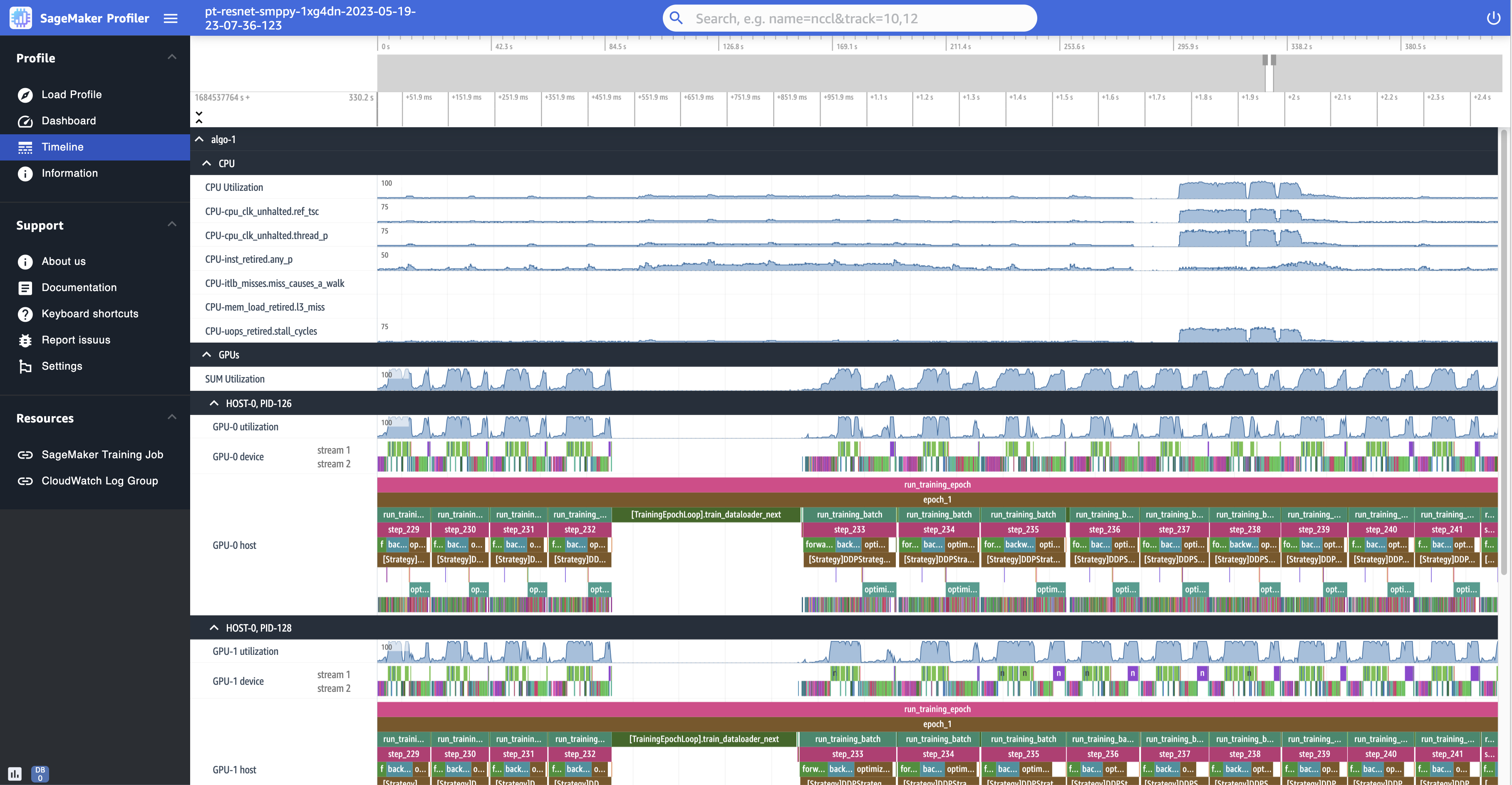
For each CPU, you can track the CPU utilization and performance counters, such as
"clk_unhalted_ref.tsc" and
"itlb_misses.miss_causes_a_walk", which are indicative of
instructions run on the CPU.
For each GPU, you can see a host timeline and a device timeline. Kernel launches are on the host timeline and kernel runs are on the device timeline. You can also see annotations (such as forward, backward, and optimize) if you have added in training script in the GPU host timeline.
In the timeline view, you can also track kernel launch-and-run pairs. This helps you understand how a kernel launch scheduled on a host (CPU) is run on the corresponding GPU device.
Tip
Press the f key to zoom into the selected kernel.
The following screenshot is a zoomed-in view into step_233 and
step_234 from the previous screenshot. The timeline interval
selected in the following screenshot is the AllReduce operation, an
essential communication and synchronization step in distributed training, run on the
GPU-0 device. In the screenshot, note that the kernel launch in the GPU-0 host
connects to the kernel run in the GPU-0 device stream 1, indicated with the arrow in
cyan color.

Also two information tabs appear in the bottom pane of the UI when you select a timeline interval, as shown in the previous screenshot. The Current Selection tab shows the details of the selected kernel and the connected kernel launch from the host. The connection direction is always from host (CPU) to device (GPU) since each GPU kernel is always called from a CPU. The Connections tab shows the chosen kernel launch and run pair. You can select either of them to move it to the center of the Timeline view.
The following screenshot zooms in further into the AllReduce
operation launch and run pair.

Information
In Information, you can access information about the loaded training job, such as the instance type, Amazon Resource Names (ARNs) of compute resources provisioned for the job, node names, and hyperparameters.
Settings
The SageMaker AI Profiler UI application instance is configured to shut down after 2 hours of idle time by default. In Settings, use the following settings to adjust the auto shutdown timer.
-
Enable app auto shutdown – Choose and set to Enabled to let the application automatically shut down after the specified number of hours of idle time. To turn off the auto-shutdown functionality, choose Disabled.
-
Auto shutdown threshold in hours – If you choose Enabled for Enable app auto shutdown, you can set the threshold time in hours for the application to shut down automatically. This is set to 2 by default.
